|
Reference Photo Practice Sketch (fun) Final Piece
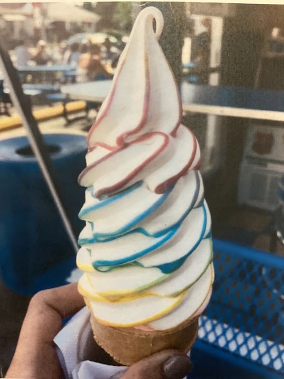
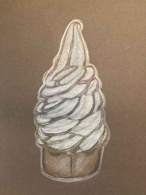
This was a lil baby project. There were various pictures of ice-cream and cupcakes to choose from, and then we had to draw the picture we chose on black or brown construction paper. We spent days working on shading methods and the proper way to color with Prisma-Colors in preparation for this project. I did the fun sketch in a totally different style just to get used to the shape. This is my first time working with colored pencils and being happy with the finished product! I know I could have added some better highlights, or more detail on the cone, but I believe this is 1,000 steps up from where I was before this unit!! I'm happy with how I replicated the ice-cream shape, and a fairly similar syrup color ratio (even if my blue isn't as vibrant). I think experimenting beforehand is really helpful, especially with different colors of paper.
0 Comments
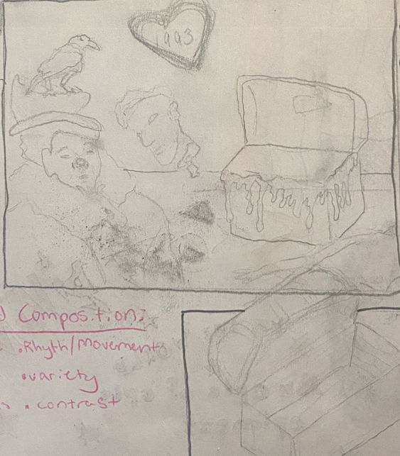
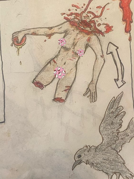
Persephone Concept Sketch  The Chest and the Raven Concept Sketches
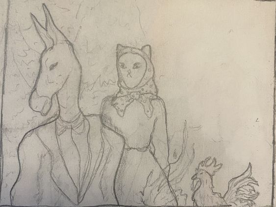
Bremen Town Musicians Formatting Sketches 
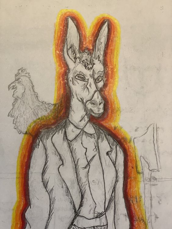
Final Sketch Doodle I Did Beneath Final Sketch
Finished Piece 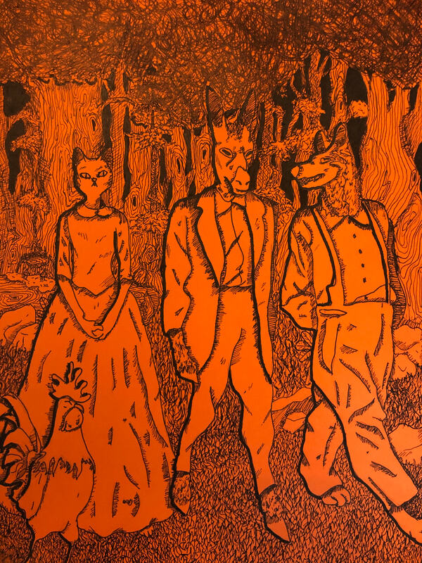 1. Discuss your decision on pen and ink techniques. Why you chose to use one or more. (If you used stippling in certain areas explain why you chose this technique. Explain for all other techniques used). I used almost every type of shading. Hatching, stippling, cross hatching, and many invented patterns (like the wood pattern, grass pattern, and scribbling in the trees). 2. How did you use perspective? Why is perspective important? The perspective shows the distance between the humanoid animals and the forest behind them, and perspective is important because it can give two dimensional pieces more depth than they actually have. 3. How is texture important in your composition? The textures in this piece were everything!! From the fur on the animals to the bark on the trees, I was told this piece was busy. Having multiple textures helped to differentiate between scenery and characters. 4. Why is value so important in this project? I tried to make the characters lighter than the backdrop at the front, but darker at the back. I was intending for it to look like they were walking towards light, while the darkness helped separate them from the landscape behind them. Value adds atmosphere, gives perspective, and helps determine focal points. 5. Describe your craftsmanship (How well the project is crafted technically) I believe a lot of the background textures were rushed and/or a little forced, and I agree with other students that my piece was too busy. I'm still happy with my idea, but the execution could have been a lot cleaner. 6. If you could recreate your piece what would you do differently to enhance your final outcome? Like I said in the last question, I would simplify the background, to make the characters pop out more, and I would have added a burning house somewhere in the distant background for more story incorporation. 7. (Only answer if you did fairytale) Which Fairytale or Fable did you create? How did you represent the story in your own way? I did the Bremen Town Musicians, a classic Grimm Brothers fairytale and one of my childhood favorites. (If you're interested in reading it, one version is here: https://germanstories.vcu.edu/grimm/bremereng.html ). I modified the story's usual imagery to make the characters humanoid, similar to Bojack Horseman but with a different art style. I did not include any of the plot imagery, like instruments or a burning cabin. I portray them as they are in the beginning, banding together and walking through a forest. 8. When applying the pen and ink techniques why and how is it important to make sure you understand the concepts taught in class? Different types of shading can totally change the perspective and/or atmosphere of an object! Knowing where it is best to apply cross hatching vs stippling can be very helpful in the long run when you need to create the best shading for whatever lighting or perspective you're working with. 9. As a growing artist how do you think what you have learned will guide and better your future projects. A sense of permanence in work. There is no erasing or taking things back, it taught me to go with the flow. I also learned about all kinds of shading that I use in my sketches now! I also liked how with the ink, every fairytale situation looked even a little dark, everything being defined by the shadows it casts more than the object itself. Learning how to adapt genres is really cool and important for the future.
This unit taught us how to use patterns to give drawings value. The first drawing is multiple 9-section value charts showing different techniques. The other two show stippling practice on other shapes, to get value practice.
During this project we learned how to control the lightness of the pencil to create color gradients. For the first one we did a 9-section gradient, and two different shapes (in my case an orb and a cone-like structure). For the second one we drew two shapes casting shadows on each other based off of the shapes on the table. Finally, we drew other objects on the table, using the shading we had learned.
At first, the class began with one point perspective, working through two and three, and eventually learning birds and worms eye view. Finally, we built a structure out of legos and sketched it in point perspective.
For this project, we were told to draw 1. A shoe with laces 2. A human face 3. A city from 2 point perspective and 4. A human hand (ours). I drew my Buffalo London boots. I was unaware that we were allowed to use a reference picture for the person, so that one is not particularly based on anyone. For the third I drew a medieval city with multiple vanishing points, and for the final I drew my left hand (even though I was using this to draw). This was to assess where our art skills were from our previous class.
|
|